This week’s progress update brings UI and UX improvements to the MauiKit toolkit and additional features to the apps, pursuing our goals of a convergent environment.
Are you a developer and want to start developing cross-platform and convergent apps, targeting, among other things, the upcoming Linux Mobile devices? Then join us on Telegram: https://t.me/mauiproject.
If you are interested in testing this project and helping out with translations or documentation, you are also more than welcome, ping us, and we can get started.
The Maui Project is free software from the KDE Community developed by the Nitrux team.
This post contains some code snippets to give you an idea of how to use MauiKit. For more detailed documentation, get in touch with us or subscribe to the news feed to keep up to date with the upcoming tutorial.
We are present on Twitter and Mastodon:
https://twitter.com/maui_project
https://mastodon.technology/@mauiproject
MauiKit
MauiKit provides extra components following the Maui Human Interface Guidelines.
ToolBar
The ToolBar, when scrollable, does no longer display a scrollbar, instead it just uses an indicator, since the mouse wheel or touchpad gesture can be used for scrolling instead.
The middle content can now be forced always to be centered on the full width, with forceCenterMiddleContent property.
Dialog
The popup dialog close button now follows the system settings on Linux, and for the other platforms, it follows the window controls default side.
The side of the button is determined on Linux by picking the KWin config settings.
Stricter close policy on the dialogs, resulting in only closing the popup dialog on explicit actions like hitting close icon or clicking Esc key.

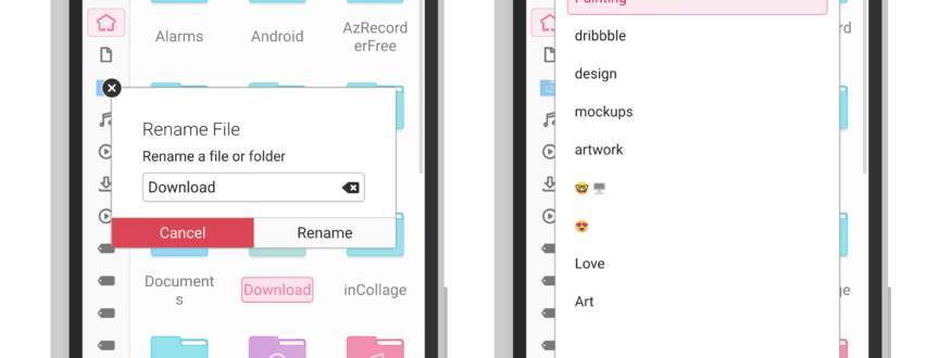
The Dialog component now styles the default buttons more consistently:
TabButton
The TabButton used in the TabBar has a default close button; this button also follows the right side depending on the platform.
Editor & Document Handler
The Editor control and DocumentHandler are now more stable.
A bug causing a crash when changing the highlighting syntax theme has been fixed.
Page
The Page component has a header and a footer; the header can be moved to the bottom on phone devices for reachability reasons, this has now become its property: altHeader and adds up to the new header and footer properties: floatingHeader, floatingFooter, autoHideHeader, headerPositioning, and footerPositioning.
The floating header/footer blurs the content behind it that is overlapping.
Maui.ApplicationWindow
{
    id: root
    height: 800
    width: height

    Maui.App.enableCSD: true

    autoHideHeader: true
    floatingHeader: true

    headBar.leftContent: ToolButton
    {
        icon.name: "love"
    }

    footBar.leftContent: ToolButton
    {
        icon.name: "love"
        onClicked: root.altHeader = !root.altHeader
    }

    flickable: list

    ListView
    {
        id: list
        anchors.fill: parent
        model: 20
        spacing: 20

        delegate: Rectangle
        {
            width: 100
            height: 68
            color: "orange"
        }
    }
}
ToolActions
ToolActions groups related actions together; this update allows the actions to display text by using property hints such as ToolButton.TextBesideIcon, ToolButton.TextOnly and ToolButton.IconOnly
Maui Apps
Some apps see some small papercut fixes provided from MauiKit, and small features were added.
Index
The file manager now has the option to use a translucent sidebar; this was also added to Nota and Vvave. It can be disabled if your compositor settings do not enable the blur effect.

More options were added to the Settings dialog: Stick sidebar, to whether collapse the places sidebar into a thin bar or to hide it completely, and finally an icon size option.

Nota
The simple text editor now includes more configurable options, such as new focus mode, switching on and off the syntax highlighting, and editor background color options.
Nota also now has a translucent sidebar. 
The floating button to create new documents does not longer overlap the editor toolbars, and on small screens, the editor takes the full-screen height when editing.
The new focus mode puts the content first without any other UI distractions.

Station
The terminal emulator now has a settings dialog to configure different terminal style options.

Pix
Pix now works for macOS, it still needs platform integration, but that should come from MauiKit side eventually, and benefit all the other apps too.
Added the option to change the thumbnails previews:

In Progress
CSD
In GNU/Linux MauiKit looks into KWin config to determine the right control’s theme and buttons distribution, for this to work with 3rdparty themes it will be necessary to create a copy of the wanted theme and place it on the Maui config folder, the structure is pretty simple: if the theme is name BreezeSierra, then a BreezeSierra folder must exist in ~/.local/share/maui/csd with a config.conf a file describing the button assets and other properties like border-radius and wether request to mask the buttons with the system color scheme or not:

[Close]
Normal=close.svg
Hover=close-hover.svg
Pressed=close-pressed.svg
Backdrop=close-backdrop.svg

[Maximize]
Normal=maximize.svg
Hover=maximize-hover.svg
Pressed=maximize-pressed.svg
Backdrop=maximize-backdrop.svg

[Restore]
Normal=restore.svg
Hover=restore-hover.svg
Pressed=restore-pressed.svg
Backdrop=restore-backdrop.svg

[Minimize]
Normal=minimize.svg
Hover=minimize-hover.svg
Pressed=minimize-pressed.svg
Backdrop=minimize-backdrop.svg

[FullScreen]
Normal=fullscreen.svg

[Decoration]
BorderRadius=6
MaskButtons=false
Supported Platforms
Platform integration for Android and macOS is still work in progress. For macOS touch bar actions integration and Android native notifications.
KIO usage on Windows and macOS is wanted, but it’s still under development.
UI Controls
TabsBrowser still under development; it will allow us to create dynamic tabs and handle the interaction quickly.
Testing
Testing more immersive UX for some applications, this has been done by making use of the new Page toolbars properties and CSD.
Below you can see a video demo of how the immersive UX concept has been applied to Maui Apps like Pix, Vvave, and Nota.


